As part of my project, I also have to do a Movie Poster for my chosen movie & genre, so for research I have decided to choose three to four movie posters, and analyse them, to see what the conventional features of the posters are, and what else is included in the poster which makes it unique.
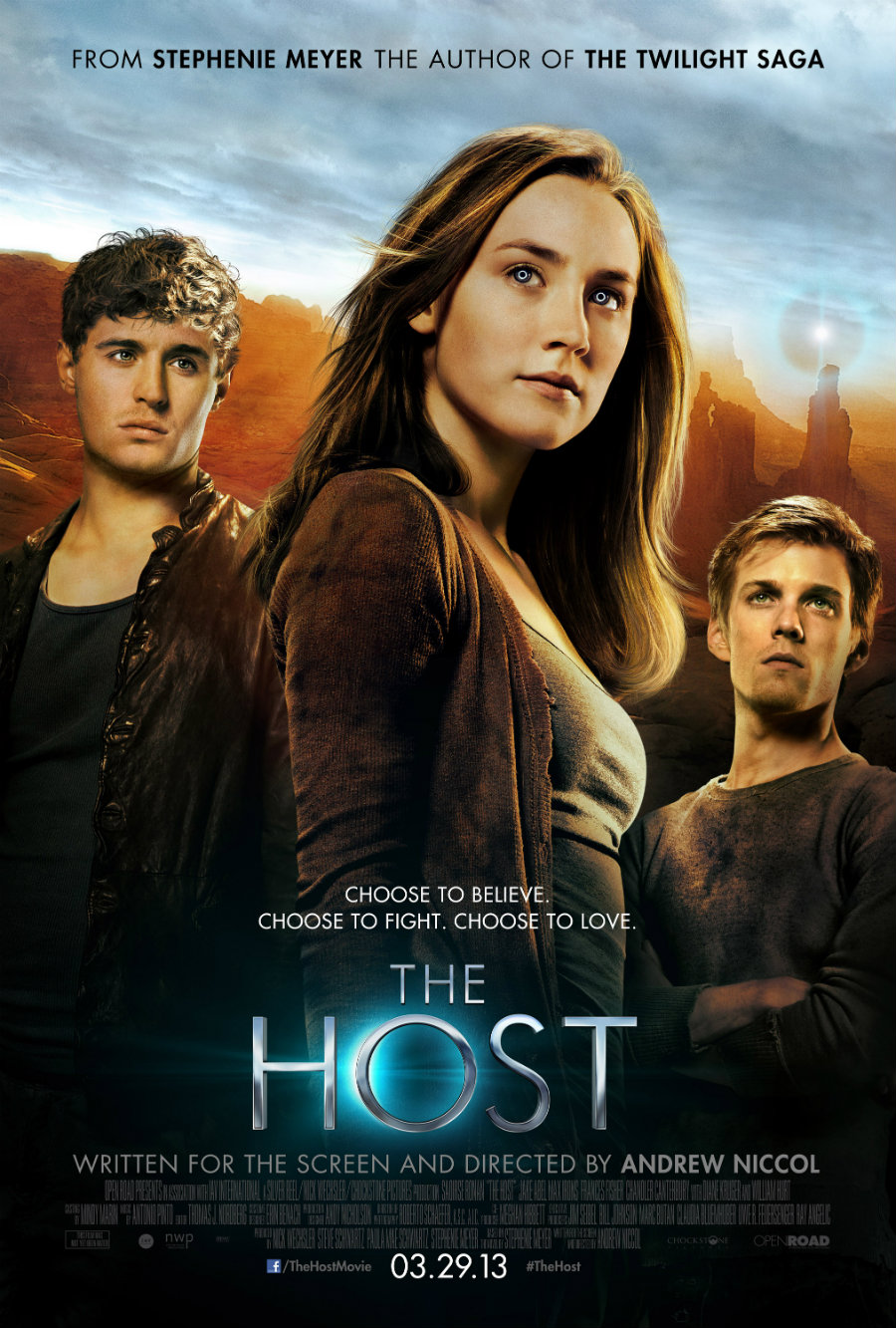
The Host...
 This has the three important characters on the poster, with the main in the middle. It also features one of the main locations, which if people have read the book would recognise, this is probably to attract those who have read the book to see the film adaptation. The positioning of the two male characters is interesting, one is higher than the other. This suggests that one has more power, or is slightly more important within the storyline, again, those who have read the book may recognise this or them and understand this.
 They have also put the author of the book at the top of the poster, in bold, to emphasise who it is, and to show that she has written another popular franchise, therefore trying to advertise to that particular audience. It also has the billing block at the bottom, this is conventional on all film posters. The film slogan is above the film title, this is not the same with all film posters, the majority have it underneath the title, but there are some that have it above. I also find that the fact that the title is smaller than the actors on the poster is interesting. It tells me that they are trying to advertise who is in the film, rather than what the film is called or is based around. They have the directors name clearly written at the bottom, so the audience know who has directed it, therefore they can predict whether it will be good or bad.
The Twilight Saga: Eclipse...
 The Host's movie poster looks similar to this poster, it could have been based on this poster. Again the three main characters on the poster, with the most significant in the middle. The film title in the middle this time, with the slogan underneath, this is different than The Host's movie poster, this is slightly more conventional. Again I think because these actors are now well known when this came out, this is why they are so big on the poster, rather than have the title big as well. It could also be that the audience just need to see the actors to know what the film is.
Again the billing block at the bottom of the poster, this is a conventional feature on all posters & DVD cases. It's grey and dark, signifying danger, and that something big is going to happen in the movie. The same font is used on all the twilight movie posters and books, signifying a link with all four films, and allows the audience to know that they are based on books by the same author. It also has the date of release, just like the movie poster for The Host. The fact that the two male characters are at equal heights shows that they have an equal importance in the film.
The Hobbit...

Also the fact that there is only one person on this poster tells me that he is the most significant character in this film. The date is at the bottom, and also it says you can see it in 3D. It also has the website on it, enabling the audience to interact with the film in more ways, rather than just watch the film.
Star Trek: Into Darkness...
 For this poster, the tag line is at the top of the poster, linking with the background image. A long shot one of the main character walking away from the scene, this gives us the idea that he may be the villain, this is also shown in his facial expression and the clothing he is wearing. The font used in the title is like a battered sign, thus relating to the destruction in the background, it's also quite a spacey font, to link in with the genre of the film.
  We can tell that the film is set in the future, not only from the title, but the also from the type of buildings in the background. The billing block at the bottom gives all the usual information, it also has information about how you can watch it in 3D, what the website is, and when it will be released. I can also tell that not only is the film trying to appeal to the older, original Star Trek fans, but is also trying to introduce people of this era, and young people to the franchise as well. You can tell this by the use of CGI, modern type fonts, and how dramatic it looks compared to the movie poster of the first ever Star Trek movie. This poster is a lot colourful, and less dramatic, it has the three main characters of the movie, and is less professional looking than the latest movie poster.
No comments:
Post a Comment