Monday, 21 October 2013

Production Companies....

For the production company I have used the production company that I created for my AS project. I figured it would link the two projects effectively and I could include things such as 'From the makers of Loanshark' on my poster and would be less hassle and easier than coming up with a brand new production company. I may use a different version of the logo in my trailer as I think it would look better big, the small logo on my poster looks good on my poster as it's small, making it big could cause issues with clarity and being able to read it, so I have made a similar if not identical copy, but with a lighter background, for my trailer so it is easier to read and recognise. 


This is the revamped logo. As said above, this will look better in my trailer, less fuzzy and easy to read. It also looks a lot more professional and cleaner than the last logo in my opinion and gives a sense of progression, as if the company has made money since the last 'film'. It also matches with my poster and colour scheme as I am going for a monochrome colour scheme as it coincides with the conventions of thriller/romance/action films such as The Host.


This is the original production company logo, the improved logo looks a lot more clearer than this, and a lot more professional. The text is a lot more clearer and easier to read, it's not as blurry and is more monochrome than this logo. I really like the improved version as it's more me rather than the logo created by the group I worked with on the AS project. It works well with my poster and colour scheme, and just looks cleaner than this logo. 

Sunday, 20 October 2013

Main Storyboard...


For my main story board, I planned it in my book first, planning what shots, music and what I wanted my characters to do within each shot. It was very brief and had little detail. Once I had finished, I got two or three A3 storyboard pages and wrote out in detail every shot, once I had finished I went back and drew images to represent what would happen in each shot. I have decided to write up my storyboard in full as well as a paper version.                                                                                                                                                                                                                      


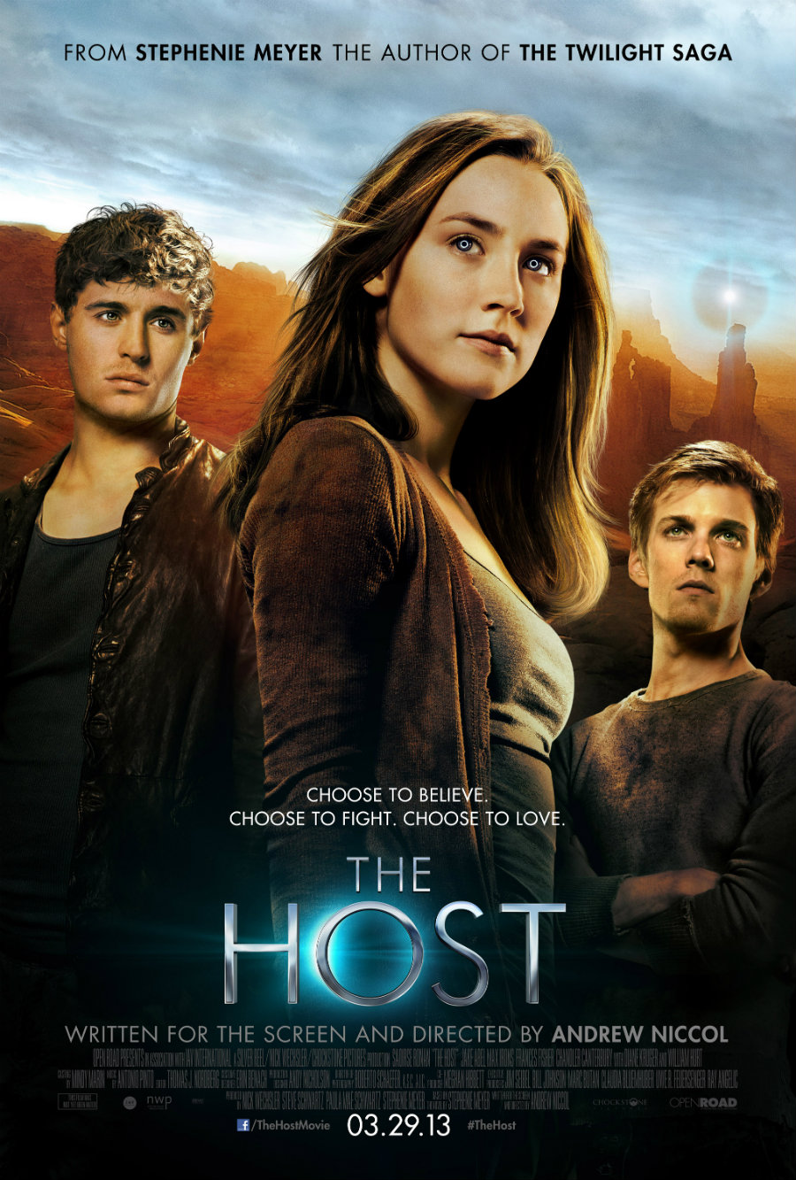
Storyboard: 'The Choice'

Shot 1: Title screen, black background, white text, sans serif font, text fades in; 'Three Lions Productions present...' fades out, and colour fades into next shot.

Shot 2: Fade into establishing shot of town centre, people walking and talking, music is quiet in background, voice over: 'What if not everyone was human?' Fades into next shot.   
                                              
Shot 3: Fade into wide shot, this time movement is slowed to reflect what is being said. Voice over: 'That they are more different than we realise...' Music still quiet so voice over can be heard, fades out and into next shot. 

Shot 4: Fades into a close up and camera slowly zooms into the main characters face, voice over; 'That there were others.' Music starts to build up quietly, cuts to next shot.

Shot 5: Title shot, black background, white text, sans serif font, fades in; 'From the director of Loanshark...' text fades out. Music starts getting louder, shot cuts to next shot.

Shot 6: Pan/aerial (?) of location, setting the scene/introducing setting. Music still building up and cuts to next shot.


Shot 7: Medium close up of first main character Stephanie, camera slowly zooms in, she turns towards the camera, hair swishes. Music is still building up, quite loud at this point. Cuts to next title shot.

Shot 8: Title shot, black background, white text, sans serif font, text fades in; 'Megan Phipps' text fades out, music is loud in background, cuts to next shot.                        

Shot 9: Close up of second main character, introduces this character, camera slowly zooms in, music is quite loud, nearing climax, shot fades into title shot.

Shot 10: Title screen, black background, white text, sans serif font, text fades in; 'Curtis West'. Text fades out, music still building in background, shot fades into next shot.

Shot 11: Pan/long shot of characters running, they are constantly looking behind them, panicked, heavy panting, music starts to climax, quietens when voice over starts; 'What if you had choose?' shot cuts to next one. 

Shot 12: Title shot, text fades in, black background, white text, sans serif font; 'A story of love and heartache...' text fades out, music still loud, this shot fades into next shot.

Shot 13: Two shot/slow zoom, two main characters close together, each has their hand on the others cheek, faces slowly move closer together, music becomes softer, voice over; 'Between the one you love...

Shot 14: Medium shot/reverse zoom, Connor gets taken away, he struggles against the person taking him, camera slowly zooms out as he is pulled away, music becomes slightly more dramatic, shot fades out.

Shot 15: Fades in, close up of main character Stephanie, her reaction, music quietens slightly as she speaks; 'NO!' music gets louder, quick cut into next shot.

Shot 16: Wide shot, fight scene between Stephanie and the 'others'. Music quietens slightly for voice over; '...or saving the entire world?' Music gets louder again, quick cut into next shot. 

Shot 17: Quick cut in time with music, long shot and camera zooms into second main character, music reaches climax, quick cut into next shot.

Shot 18: Master shot of 'others', they slowly walk towards the camera, music still in time with cuts. Quick cut into final title shot.

Shot 19: Final title shot, black background, white text, sans serif font, text fades in - 'The Choice' 'In Cinemas November 2014' '#thechoice' 'www.thechoicemovie.com' Music stops and fades out.


I should note that since writing this post, I have actually changed my main story ever so slightly, by adding in a few more shots and changing others, I have reviewed my first draft of my main storyboard and felt that some shots needed to be switched and that some needed changed and/or removed.

Thursday, 17 October 2013

Main Idea & Script...

This is the genre, storyline and the characters of my film. I had based my storyline on films that I had watched prior to starting this post, I didn't want to do the same genre film as last year as I wanted to challenge myself and do something different. I don't know if this idea will stay the same through out, but I think it's a good basis for my trailer. 

Genre: 

Drama/Romance/Fantasy


Characters:

Female protagonist (main) called Stephanie, Male character called Connor, lover to the main character, villains/family.

Storyline: 

A group of people arrive at a small town, little do they know these people are not actually humans, but aliens who have evolved to look like humans in order to reclaim their home planet and not look too suspicious. One of the human like aliens however, does not want to take part in this, and has a human conscious, he tries to undo what they have done when he can. On the other hand, a girl who has successfully escaped from these creatures, wanders a lone, desperate for help, until she sees him. Together, they work to save as many people as they can, they eventually fall in love, but get found out, he get's taken away, and she has a choice - Sacrifice the one she loves, or save the entire world?


This is the script for my trailer. I was able to work out the dialogue for my trailer due to storyboarding, I was able to picture my trailer and imagine how I want it to look, and the dialogue came to me. I still need to work out some of the character names, I have put some, but I might change them as I storyboard. 


Script for 'The Choice'


Characters:
Stephanie - Megan Phipps
Connor - Curtis West

Shot showing people moving, setting the scene, music is quiet so main character can be heard;

Voice Over: What if not everyone was human?

Movement within the scene is slowed/sped up, music is still quiet;

Voice Over: That they are more different then we realise?

Character is shown at this point by using a close up and the camera slowly zooms in, music is quietly building up;

Voice Over: What if there were others...

The characters are running, they are constantly looking behind them, they are scared, music starts to climax at this point;

Voice Over: What if you had to choose?

The two main characters move in close, both putting each others hands on each others face, music is soft & slow, the audience can tell that there is some chemistry between these two characters;

Voice Over: Between saving the one you loved...

Fight scene, the main female character is fighting off the creatures, music starts to build up again;

Voice Over: ...or saving the entire world?


Title screen comes on - 

The Choice
In cinemas November 2013


Tuesday, 15 October 2013

Brainstorming Film Names.....

Once I had my trailer idea, I decided to brainstorm names and slogans. I had names such as 'The Invasion' but this was too sci-fi 'ish', and didn't fit in with my film genre, I then went with 'Others' but this was too similar to another film, so I then went with 'The Others' but I didn't like how this sounded, I then came up with 'The Choice' and thought this suited my film as it's all about making choices, deciding between saving the one you love or saving the world. I liked Encounters, but again I felt it didn't suit my chosen genre and would probably suit a more sci-fi movie.Invaders was another film title, but it reminded me of the name for the game 'Space Invaders', I didn't want to focus solely on the 'others'. So in the end I went with 'The Choice' as I felt it summed up the film and the plot-line perfectly and didn't sound to 'spacey'

For the slogan, I came up with three, 'We aren't alone', 'What lies beyond?' and 'Could you choose?' I went for the third one as it went with my chosen title quite well, although it was tough decision as I liked all the slogans, I felt that this went well with what my film is about, which is deciding between love or saving the world. Brainstorming was useful as it made it easier to come up with ideas for names, as I find it difficult to come up with names for stories, films etc. 


Mind map of ideas....


Wordle of ideas...

Monday, 14 October 2013

Preliminary Storyboard...

My main idea is the first idea I came up with on my list of ideas, (on a previous post). I liked this idea as it was different an something I could get into. So, before I start my main story board, I thought I would start on making a preliminary storyboard to plan out what I want in each scene, and then elaborate and go into more detail or maybe add more scenes in my main storyboard. 

Shot 1:

  • Establishing shot of town, introducing setting
  • Voice over - 'What if not everyone was human?'
  • Establishing shot shows people moving at normal pace
  • Music starts off quiet, to allow voice over to be heard

Shot 2:

  • Movement is slowed/sped up, time-lapse like
  • Voice over continues - 'That they are more different than we realise.'
  • Slow pan, music quiet in the background to allow voice over to be heard

Shot 3: 

  • Close up of main character/narrator
  • Voice over finishes at this point - 'What if there were others...'
  • Music starts to build up at this point

Shot 4:

  • Pan of filming location
  • Music quietly building up
  • Titles start - From the director of Loan Shark...


Shot 5

  • Medium close up of main character (Megan), she turns towards the camera, hair swishing
  • Credits start up, fades in and out. (Megan Phipps...)

Shot 6:

  • Close up of second main character (the others) has glowing eyes, may show more
  • Credits fade in & out (actors name...)
  • Music still building up
  • Quick fade out

Shot 7: 

  • Quick fade into this shot
  • Characters are running, looking back behind them
  • Voice over - 'What if you had to choose?'
  • Music starts to climax

Shot 8:  

  • Two main characters move in close, the female character moves her hand to rest it on the cheek of the male character
  • Voice over - 'Between saving the one you loved...'
  • Music becomes softer, showing the relationship of the two characters

Shot 9: 

  • Quick cut into fight scene between the main character (who is human) and the others (who are the aliens) 
  • Voice over - 'or saving the entire world...'
  • Music starts to build up again
  • Pan following the one who got kicked/hurt

Shot 10:

  • Title screen, titles fade in, titles are white, glow like effect to link with the others glowing eyes, black background
  • Title - 'The Choice' 'In cinemas November 2013'
  • Music fades out, film credentials come up

Film poster practice...

I decided to do a practice poster, in preparation for my main film poster. I got the images from Google, and used Photoshop to edit them together.


I got the name for this film from the background image I used, and from this came the slogan for the made up film. It was good practice for me as I had never used Photoshop before in my media projects, and I was good to get back into the swing of editing. I also found a billing block to place at the bottom, and found a age rating. I also used a font which didn't look to tacky, and actually looked professional. I also tried to find an effective text effect to make it  stand out, I found this effect, which made it look really eerie, and reminds me of ghosts. I also found an image of a pair of red glowing eyes, which had a black background, this was good as it allowed me to shrink it, and fit in the dark area of the image, without it sticking out too much.  


This poster I did on PhotoPlus, again, I used a background image from Google images, and copy & pasted a billing block on the bottom. I also got the title from the background image, as it reminded me of Snow White, and the tagline came from this title. I did feel that there was something missing underneath the title, but I didn't want to add too much.  


Thursday, 10 October 2013

Editing Practice...

We decided to go around the school, and take photos of anything we found interesting, then uploaded them to our computor, and we used a software called iPhoto, and practiced editing them in preparation for our projects. It was really good practice for me, and a good refresher as well. 


For the first photo I changed the colour and added a vignette, I also changed the contrast and made it slightly bolder. I like the colouring of this photo as it gives is an eerie look, but also looks semi-realistic at the same time.  I also like the photo itself, and how it was taken, as it  looks really geometrical. I like this photo, but I don't think it's the best, this was the first photo I edited so it was just a experimental photo, gradually I got the hang of it with the next two.


For this photo I changed the contrast, added a vignette around the outside to add a deep focus, I used a black & white which turned out similar to a Sepia effect because of the change of contrast. I also made it slightly brighter to add to the contrast. I like the look of this photo as it gives it an aged look, and the deep focus type effect allows people to focus on the none blurry part of the photo, which in this case is the centre of photo.


For this photo I decided to use an effect which blurred the photo, and made it look like it was reflecting the image. I also changed the contrast & the brightness of the photo to make it colourful and bold. I liked this effect as it looked interesting and effective,  and worked well with the objects in the image already.  I don't like the top part of this photo as much as the bottom half, as I like the reflection effect on the bottles, the top part looks too bright for me.


Tuesday, 1 October 2013

Movie Poster Analysis...

As part of my project, I also have to do a Movie Poster for my chosen movie & genre, so for research I have decided to choose three to four movie posters, and analyse them, to see what the conventional features of the posters are, and what else is included in the poster which makes it unique. 

The Host...

This has the three important characters on the poster, with the main in the middle. It also features one of the main locations, which if people have read the book would recognise, this is probably to attract those who have read the book to see the film adaptation. The positioning of the two male characters is interesting, one is higher than the other. This suggests that one has more power, or is slightly more important within the storyline, again, those who have read the book may recognise this or them and understand this. 

They have also put the author of the book at the top of the poster, in bold, to emphasise who it is, and to show that she has written another popular franchise, therefore trying to advertise to that particular audience. It also has the billing block at the bottom, this is conventional on all film posters. The film slogan is above the film title, this is not the same with all film posters, the majority have it underneath the title, but there are some that have it above. I also find that the fact that the title is smaller than the actors on the poster is interesting. It tells me that they are trying to advertise who is in the film, rather than what the film is called or is based around. They have the directors name clearly written at the bottom, so the audience know who has directed it, therefore they can predict whether it will be good or bad.


The Twilight Saga: Eclipse...

The Host's movie poster looks similar to this poster, it could have been based on this poster. Again the three main characters on the poster, with the most significant in the middle. The film title in the middle this time, with the slogan underneath, this is different than The Host's movie poster, this is slightly more conventional. Again I think because these actors are now well known when this came out, this is why they are so big on the poster, rather than have the title big as well. It could also be that the audience just need to see the actors to know what the film is. 

Again the billing block at the bottom of the poster, this is a conventional feature on all posters & DVD cases. It's grey and dark, signifying danger, and that something big is going to happen in the movie. The same font is used on all the twilight movie posters and books, signifying a link with all four films, and allows the audience to know that they are based on books by the same author. It also has the date of release, just like the movie poster for The Host. The fact that the two male characters are at equal heights shows that they have an equal importance in the film.  


The Hobbit...

This poster is similar to the other two posters, it has the director on the top of it, it says it's directed by the same director who did Lord of The Rings. It has a medium close up of the main actor, which is bigger than the title, to allow the audience to recognise the actor. The billing block is at the bottom of the poster, this is the same as before, this is conventional on all posters. The font used in the title, is similar to that used in The Lord of The Rings. This then shows that these movies and trilogies are linked, written by the same author, thus advertising to that particular group of people.

Also the fact that there is only one person on this poster tells me that he is the most significant character in this film. The date is at the bottom, and also it says you can see it in 3D. It also has the website on it, enabling the audience to interact with the film in more ways, rather than just watch the film.  


Star Trek: Into Darkness... 

For this poster, the tag line is at the top of the poster, linking with the background image. A long shot one of the main character walking away from the scene, this gives us the idea that he may be the villain, this is also shown in his facial expression and the clothing he is wearing. The font used in the title is like a battered sign, thus relating to the destruction in the background, it's also quite a spacey font, to link in with the genre of the film. 

We can tell that the film is set in the future, not only from the title, but the also from the type of buildings in the background.  The billing block at the bottom gives all the usual information, it also has information about how you can watch it in 3D, what the website is, and when it will be released. I can also tell that not only is the film trying to appeal to the older, original Star Trek fans, but is also trying to introduce people of this era, and young people to the franchise as well. You can tell this by the use of CGI, modern type fonts, and how dramatic it looks compared to the movie poster of the first ever Star Trek movie. This poster is  a lot colourful, and less dramatic, it has the three main characters of the movie, and is less professional looking than the latest movie poster. 


Genre Research....

Before I start preparing my trailer I thought I would do some genre research to further my planning and help me with brainstorming ideas. As I was doing my research, I found that there were hundreds of sub-genres as well as the main genres that we know today. I have decided to list the main genres, write what they are, give examples of films within the genre and explain how they portray that genre.

Action:

These are films which feature multiple scenes of action which is destructive and spectacular. If a movie only includes one scene action i.e. a plane crash, it is not considered an action film. 

Examples of Action films: The Expendables 3, Taken, Lara Croft, Transformers.

These films show the typical conventions of an action film; fast paced scenes, explosions, brave and courageous main protagonists and fast paced music. In The Expendables 3 trailer, the lighting is monochrome, so you could just about make out all the actors and recognise them, the font is a army style font to show the seriousness of the film, red is used for the text as red signifies danger, blood, war, power & strength, all associated with action films. Fast cuts are used to signify the pace of the movie, lot's of close-ups and camera movement used to keep up with the movement of the action. There's lot's of shots showing weaponry and explosions to help the audience understand what type of film this is going to be and to show the power and pace of it as well.


Adventure:

These are films which show multiple, consecutive  and inter-related scenes of characters participating in dangerous but exciting experiences for a particular goal. It is sometimes confused with action, although it can be supplied with it.

Examples of Adventure films: Indiana Jones, The Lone Ranger, Walking With Dinosaurs.

Like action films, adventure films like for example Indiana Jones and The Mummy have a lot of panning shots to coincide with the amount of movement. There's also a lot of close-up shots, few explosion shots, zooms, and two shots. The music is fast to match the pace of the quick cuts, and sounds very dramatic. For the Indiana Jones trailer, and possibly The Mummy trailers, there are theme tunes in which the audience can recognise as being from these particular movies, once they here the particular music they instantly know who the characters are, what the film may include and whether or not they want to watch it. These are typical in adventure films, and can be seen in action films such as James Bond. 


Biography:

The primary focus in Biography films is the depiction of the activities and personality of a real person or persons, for either certain parts of their life, or all of their life. These specific events may be re-enacted or described in the style of a documentary. They must be factually accurate, and within the limitations of dramatic necessity. 

Examples of Biographical films: Rush, Mandela: Long Walk to Freedom.

These types of film have a lot of dramatic scenes in the trailers. The trailer below shows this. Mandela: Long Walk to Freedom. It shows scenes based on real-life events, and is generally accurate in its depiction. Within this trailer, shot wise, there were many different types of close ups used, such as close-ups, medium close-ups and big close-ups, these are used to either introduce characters to the audience, and to show emotion on characters faces to allow the audience to understand and feel the same emotions as well. Medium shots were also used to show different actions, for example when young Mandela was shown with his family and was twirling his children around, and when he was also arrested. A lot of wide shots were also used to introduce settings and places to which are/were important to the main character of the biographical film, and show importance to the story-line and timeline, there were also a few aerial shots to emphasise the crowds and also the car chases. 

There were a lot of camera movements, such as panning and tilts to add to the movement and pace of the film, also emphasising his actions and the importance behind them. There were a few group shots and two shots to emphasise dialogue between characters. 

Music wise, it's quite dramatic to match what is going on within the scenes, starts off quiet to allow dialogue to be heard. The music has an African style to it, again to match the culture and person it's representing and depicting the life of. The music adds a hint of emotion behind the dialogue, especially at the end, it quickens in pace and then suddenly quietens and we hear Mandela say 'I have walked a long walk to freedom' which is the iconic phrase of Nelson Mandela and is part of the film title. Near the end, the music does become more tribal and quicker, and adds to the tension and adrenaline pumping scenes and depicts his life in an action packed way.


Comedy: 

All scenes in a comedy film contain should contain characters participating in humorous activities. Comedy in these films can either be; exclusive to the audience, at the expense of the characters, or be shared by them.

Example of Comedy films:  Anchorman 2: The Legend Continues, We're The Millers, The World's End.

The trailer for Anchorman 2: The Legend Continues shows multiple comical scenes from the film, light hearted music which quietens down when there is dialogue and/or comical scenes. There are a lot of close-ups and medium long shots to show reactions and expressions of the characters, and to re-introduce these characters to the audience and remind them of the main characters of the film. There's panning and tilts used to emphasise movement and comical actions, there is also a lot of post-production editing, such as the scene in the van near the beginning of the trailer, slow-motion was used in the van scene, this was done for comical effects and before hand, a couple of the characters were asking things such as 'Why do you have a bag of bowling balls next you?' which is then explained in the slow-motion scene and is the build up to the comical scene. Also the stupidity of the characters adds to the comical essence of these scenes, along with the music.

Music is light hearted, matches the vibe of the film and emphasises the comical actions by adding more humour and adding a light-hearted atmosphere. There are a lot of wide shots used to introduce settings and show action scenes. 


Crime:


Crime films should include numerous successive and connected scenes of characters participating, assisting and/or organising criminal behaviour for an illegal goal(s). 

Examples of Crime films: American Hustle, Now You See Me, The Godfather.

Now You See Me is a good example of a crime film trailer as it shows the significant parts of the movie without giving too much away, you can see how they break the law, and see how they are participating in criminal behaviour to achieve illegal goals. The music is fast paced, and is synchronous as it relates to what is going on within the trailer. Voice-over near the end gives the audience a summary of what to expect within the trailer, and the crime element is clearly shown throughout the trailer, with chases, interrogations and so on.  There are action filled scenes of characters breaking into areas where they are not supposed to, which further shows the illegal behaviour to achieve illegal goals. The cuts are quick and match the music, they cut at the right spot, so that each shot makes sense, and doesn't give too much away.


Drama: 

Drama films should contain multiple successive scenes of characters portrayed to effect the serious narrative of these films. This can be exaggerated to produce a melodrama.

Examples of Drama films: The Butler, The Great Gatsby

The Butler is a good example of a dramatic film trailer. It shows the right dramatic moments, and shows a balance of drama and happy, calm moments. It's not one sided, you also see the main characters being introduced in the trailer, as well as iconic settings such as the white house. The music starts of quiet, as the scenes are calm, and starts to build up as the scenes start to become dramatic, and the evens out as the trailer ends. I like the sound of the music as it isn't to loud and in your face, it compliments the shots and doesn't distract from what's going on within the trailer. The fonts used are quite simplistic, white on a black background, and fade in and out. I could apply this to my trailer, 


Family: 

Family films should be appealing to all the family, children & adults. Universally accepted viewing. These types of films are generally combined with Animation.

Examples of Family films: Despicable Me 2, The Lego Movie, Maleficent 

Despicable Me 2 is the perfect example of a family movie. It has a happy story line in which young audiences can understand easily and want to keep watching, there are in-jokes for parents which younger audiences wouldn't understand, the young audience can easily relate to the characters, and the trailer doesn't show too much of the film and keeps audiences wanted to watch the film when it comes out. The font is playful, orange on a white background, to match in with the playfulness of the film and to appeal to the target audience of the film, for instance children. 


Fantasy:

These films should include a successive scenes of characters portrayed to effect a mysterious and make-believe narrative. Not to be confused with Sci-Fi, fantasy films are generally based on magic and mystery.

Examples of Fantasy films: The Hobbit: Desolation of Smaug, Harry Potter and the Deathly Hallows.

This trailer is a good example of a fantasy film trailer. The lighting used really emphasises the fairy-tale feel of the film, and the contrast between light and dark is effective as well. The trailer has a voice-over which those who have watched the previous film would probably recognise the voice and character. The establishing shots also further show the genre, as they introduce the mountainous landscape, the pans are effective in showing this. The music is dramatic, and builds up in the right places, it's quiet when dialogue is being said so that the audience is not distracted from what is being said and they can understand what is going on, the language used is very fantasy like, again establishes genre. The fonts used are very artistic and look like game credits, which adds to the establishment of genre. The animation is effective, and the dark, clouded background adds mystery and further establishes the genre. The costumes shown also establish genre, the intricate designs and unique styles of each character, this is something for me to consider with my trailer.


History: 

Primary focus on real-life events of historical significance, with characters based on real-life people. Events should be based on what is dominating the front page of a national newspaper for current times, for older times it should be based on what is in the history books. Fictional characters, incidents, and dialogue should be minor points used to bridge gap in the record. 

Examples of History films: 12 Years a Slave, Zero Dark Thirty, Schindler's List

This is a good example of a historic film. The trailer shows historic events, but doesn't show too much, to spoil the movie. The costumes are accurate, and are not odd looking. The music is quiet, to add to the dramatic events occurring in the trailer. The trailer is in black and white, again to further establish that this is an historic trailer, and that this is a serious, but dramatic film. There are no titles within the trailer, only in the beginning and the end, this could be to draw the audience in, and that the clips shown work better without titles in between, there is no need for added dramatic effect when the film is based on dramatic events which actually happened. There is a quote from Schindler himself in the beginning of the trailer; 'I was now resolved to do everything in my power to stop this system,' This one, simple quote summarises the entire film, and also establishes the historic genre of the film/trailer.


Horror:

Horror films should contain successive scenes of characters portrayed to effect a terrifying and/or repugnant narrative. 

Examples of Horror films:  Devil's Due, Carrie, The Conjuring.

This trailer is similar to the likes of Paranormal Activity, and the Blair Witch Project in that they feature people documenting their lives, the trailer starts off calm, then builds up half way through. The use of non-scary music is interesting as in the beginning the song chosen highlights that this is a couple who are very much in love, and have just gotten married, as the trailer shows, then this stops and more sinister music starts to match with the sinister clips being shown, then the song returns at the end to remind the audience that there is a couple here, being documented. Quick cuts really emphasise the horror of the movie, the lighting starts of light to highlight good times, then starts to become darker near the end when horrific events start to take place. The music jumps and stops at the right places to cause 'jump scares' for the audience, which in turn keeps them on their toes and interested in the trailer and movie. All of these factors really add to the horror of the trailer and help to establish genre. 


Thriller:

Thrillers should include successive scenes which are sensational or suspenseful.

Examples of Thriller films: Silence of the Lambs, Prisoners, Paranormal Activity: The Marked Ones. 

This trailer is a perfect example of a thriller trailer. The music is quiet, and the dialogue can be heard, the lighting is dark and mysterious, there are many close-ups of the main characters, and the shots used add to the suspense of the film trailer. You see clips of the murder victims but are not told too much, the voice-over is simple yet effective, establishes the suspense and terror within the film. I like the way they have the criminals face flash up on screen several times throughout the trailer, again it establishes the idea that this is not just scary, but dark in more ways than one. The music starts to build up near the end, and starts to sound like screaming which fits in well with the story-line of the film. The shots of Hannibal Lecter are really well done, and show his personality really well without saying too much about him. The first close-up of one of the main characters looks as if he's talking to the audience, which brings this sense of direct mode of address, and that he's asking the audience if they scare easily, again establishing the genre of the trailer.


War:

War films should include multiple scenes that pertain to a real war, past or current.

Examples of War films: Saving Private Ryan, War Horse

This film is a good example of a war trailer as it accurately depicts the times during World War 2, the images shown really add to the historic context of the film, the narration of the letters also allow the audience to sympathise with the families, and realise how tragic the wars were back in the 40s.  The editing is effective as you can see the letters being read out with images of World War 2 in the background, which establishes the genre of the film. The music is very patriotic, but is quiet enough for people to be able to be able to hear the narration of the war letters.  The titles are small, with the text fading in and out, along with the music. The titles are white on a dark background so that the audience can read it easily. The trailer uses close-ups to introduce each of the main actors, and the majority of the trailer uses images to convey the film, the music starts to quiet down near the end when the titles fade in. All of which help to convey the genre of war. The costumes are also accurate and the colouring of the trailer is mainly black and white to link in with the depressing mood of the scenes shown, this also establishes the genre. 


Sci-Fi:

Many scenes and narrative should be based around or on (speculative) scientific discoveries or developments, environmental changes, space travel or life on other planets.

Examples of Sci-Fi films: X-Men: Days of Future Past, Star Trek into Darkness.

Star Trek: Into Darkness is a good example of a Sci-Fi trailer, the trailer shows space travel and other planets. The music is very dramatic and builds up, but is quiet when there is dialogue. The props used and the settings are also ver sci-fi ish, and further establish the genre.  Other ways in which genre is established in this trailer is through the costumes, they are very space like, and match the genre and the setting, and further establishes that this is a sci-fi film set in the future. The costumes are also modern versions of the original Star Trek costumes, so fans of the original film and TV series will be able to easily recognise these costumes, and recognise that this is a Star Trek film, and therefore a Sci-Fi film. Furthermore, the weapons used are also quite futuristic, and the explosions shown establish that this is going to feature action packed scenes as well as sci-fi scenes. The voice-over of the villain also establishes this, and the introduction of said character is very well done. We see that there are issues with Kirk, and we see that it has something to do with the villainous character we are briefly introduced to. The scenes in space further establish genre, and the technology on the ships do so as well.